Ball State Lower Thirds
Quick Tip!
It is important to select a lower third that has enough room to include the subject’s description. Make sure that there is enough contrast between the color of the lower third and the video it appears on.
Helpful Staff for this Topic


When watching videos that include one or more interview subjects, it can be difficult to keep track of who everyone is. To make this easier, the Digital Corps follows best practices by using lower thirds to identify the subject’s name and job/student description without distracting viewers from the content they are watching.
Lower Thirds and Margin Overview
As a visual asset, lower thirds quickly and easily identify subjects in a video through a combination of text and other graphical elements such as shapes, logos, and colors. When using a lower third in a video, you should place the asset within specific margins to ensure that it is visible on all screens. The lower third should animate onto the video in the corner opposite of the subject before animating off. Viewers should be able to read the graphic twice before it animates off of the screen. A good rule of thumb is to let the lower third be visible for three to six seconds before it animates off.

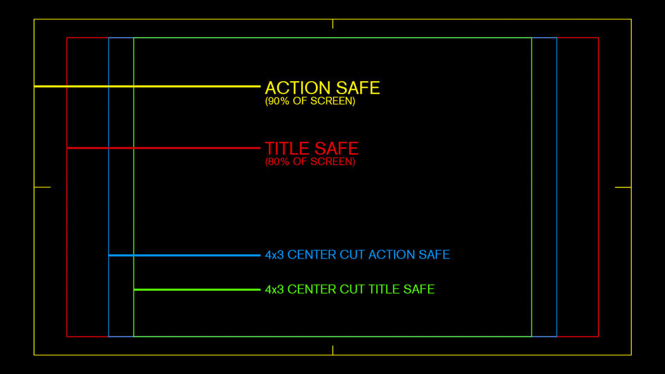
Safe Margins
When creating content, it is important to keep in mind the types of screens that viewers may be using. For example, when viewing content on a new television or computer, all content and graphical assets are likely to fit the user’s screen and be visible. However, If a user views the video on an old TV, certain assets may not be visible because the margins are different. If a lower third is placed outside of these margins, it too may not be visible. To ensure that all assets are viewable, it is important to place these assets within safe margins.
There are two safe margins that editors must use to ensure that all content is visible. These are title safe and action safe margins. Title safe margins show the guides for where to place the most important text. Action safe margins show the guides for where to place secondary text and any relevant graphics. Placing a lower third inside of these margins will guarantee that viewers will be able to see the asset regardless of the screen they are viewing content on.
Ball State Branded Lower Thirds
Ball State has its own set of lower thirds that are used in their videos. At the Digital Corps, it is important to determine which variation best fits the assigned video. To choose the correct lower third, editors should examine its color and the inclusion or exclusion of the university’s name under the crest.
Key Rules to Follow
- Do not place a red lower third on a video with a black background.
- Do not place a white lower third on a video with too light of a background.
- Only use a lower third without “Ball State University” under the crest if the video is internal for the university.
- Use a lower third with a long title if the subject’s job/student description is lengthy.
- Place the lower third in the opposite corner of the subject.
- The lower third should appear on screen for three to six seconds so that viewers can comfortably read it.
Lower Thirds (Red)


Lower Thirds (Red and White)


Lower Thirds (White)


Two Line Lower Thirds (MOGRT)
In some cases, a lower third will require two lines of text for the description of the subject. MOGRTs, lower third animation presets, are used in Adobe Premiere when two lines are needed. When using a MOGRT, only the text needs to be edited as the animation of the lower third is already created in the preset.
Check out these templates:
-
Ball State Lower Thirds:
https://ballstate.app.box.com/s/li3ms9qkrg6d8z6o1bu1sd5vi2rj6hw4