Writing a Card Sorting Report
Quick Tip!
Need a refresher on the basics of card sorting? Check out How to Conduct Card Sorting.
Helpful Staff for this Topic


Once you have conducted a card sorting, you will need to write a report of the results. Writing a card sorting report can be tricky at first, but following these steps should help ease the process. Card sorting reports utilize excel spreadsheets to create tables of results, along with qualitative analysis of these tables. For reference as you write your report, take a look at an example report.
Overall Results
To begin your report, provide an overview of how you conducted the card sorting and how that affects your results. Points to discuss in this section may include:
- Was the card sorting open or closed?
- If it was a closed card sorting, how many levels of navigation were given?
- How many participants completed the card sorting?
The context on the card sorting structure allows readers of your report to fully understand your results. If the card sorting report is not part of a larger usability report, provide information about the project researched in the card sorting.
Card Analysis
If you conducted a closed card sort, use this section to describe the primary and secondary headings given to participants. Primary headings are names or titles of pages, while secondary headings are categories or sections of content on these pages. If secondary headings weren’t strictly placed within a primary heading (meaning participants could move them), state so in this section. Below is an example table of primary and secondary headings.
| Primary Headings | Secondary Headings |
| Home | N/A |
| About | History, Culture, Mission |
The second part of the card analysis is where you assign each of your content cards to a number. This is used to help evaluate similarities and differences between participants’ card sorts. The card numbers are later used to compare the participants’ placement of the cards in an Excel spreadsheet for quantitative analysis. Card numbers should be reported with the card content in one column, and the card number in the next. The following is an example of this table:
| Card Name | Card # |
| Content A | 1 |
| Content B | 2 |
| Content C | 3 |
Quantitative Analysis
To write this section of the report, it is important to have photos of the sorted cards from each participant. Include a link to a folder containing these photos so readers can view them, if they need more context.
Navigation
To report on the number of users who placed each of the secondary headings beneath the primary headings, create a table. Primary headings appear across the top horizontally and the secondary headings vertically, like the table below:
| Home | About | Contact | |
| Services | 1 | ||
| Projects | 2 | ||
| Join Team | 5 |
In the table, place the number of participants that identified the primary and secondary headings combination. For example, in this table, 1 participant placed Services in the Home category, 2 participants placed Projects in the About category, and 5 participants placed Join Team in the Contact category. Include additional notes of participants who chose not to put a secondary heading into a primary category.
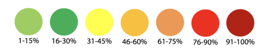
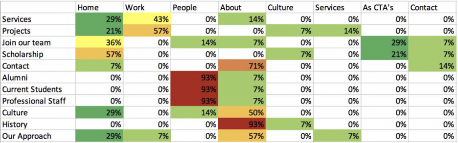
Next, use the values from this table and turn them into percentages based on the number of participants tested. Use the following color key to make the chart easier to read:
If the process is done correctly, your percentage table for primary and secondary heading placements should look something like the following:
Content Organization
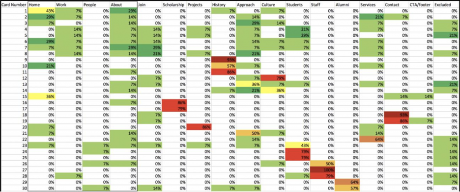
This same process is completed for all content cards. Place all headings (both primary and secondary) across the top, and all content card numbers along the side. Below is an example of the content card table:
| Home | About | Mission | |
| 1 | 1 | ||
| 2 | 2 | ||
| 3 | 5 |
Repeat the process of taking each value and converting them into percentages based on the number of participants. Use the color key to edit the chart. Once finished, the content chart should look similar to the following:
Be sure to provide a brief, but informative caption for each table included in the report. Give enough information to give the readers context, but you do not need to explain each and every result.
Qualitative Analysis
Use this section of the report to evaluate findings from the quantitative data. Discussion points can include:
- Participant behaviors and thoughts while completing the card sorting.
- Any trends or patterns between different participants’ sorting.
- Content a participant chose to exclude.
- Content a participant had trouble placing.
If possible, use the quantitative data to back up any claims made in this section.
Recommendations
Wrap up your report with recommendations on content organization for the project. Make recommendations clear by using specific headings and content terms.
Review the example card sorting report to help clarify any tables or terms while you write the report. Remember that after you finish the report, the review process is as follows:
- JPM
- PM
- UX Team Lead
- Brandon
A card sorting report can be used to share results with the rest of the team, and help determine what next steps are on a specific project. Make sure that your results are understandable from people of all teams – don’t use any UX/development jargon. A finished card sorting report can help guide the team on how to organize a website/project.
Additional Articles:
This article is part of a series:
-
1
Card Sorting 101

-
2
How to Conduct Card Sorting
-
3
Writing a Card Sorting Report